
Too long, didn’t read? Here’s the gold
- Friction kills conversions – Slow speeds, unclear CTAs, and clunky forms push users away.
- Focus on existing traffic – You don’t need more visitors, you need to convert the ones you’ve got.
- Every section is actionable – From performance and trust to SEO and mobile, nothing is fluffy.
- Quick wins make a big impact – Even small tweaks can boost sales, sign-ups, and engagement.
- This guide gives you a roadmap – Fix, improve, or rebuild your site for maximum conversions.
Your website should be working for you, not against you. If you want to increase conversions, every second it takes to load, every unclear call-to-action, and every frustrating user experience must be optimised. You might not see it, but these small issues add up. They create friction, confuse visitors, and lower trust. The result? Fewer sign-ups, abandoned carts, and missed sales.
Most businesses don’t need more traffic – they need to convert the visitors they already have. A high-performing website makes every click count. It guides users smoothly from arrival to action, whether that’s making a purchase, signing up for a service, or filling out a form.
This guide gives you 100 website fixes designed to remove friction and increase conversions. Every section focuses on a key area, from speed and mobile experience to calls-to-action, trust signals, and checkout optimisation. Each fix is practical, clear, and immediately actionable.
Start at the top or skip to the sections that matter most to you. The sooner you implement these changes, the sooner you’ll see results.
Speed and performance fixes
A slow website drives visitors away before they even see what you offer. If your pages take too long to load, users won’t wait-they’ll leave and find a faster competitor. Page speed also affects search rankings. Google penalises slow sites, making it harder for people to find you.
Page speed optimisation isn’t just about making things faster-it’s about keeping users engaged. Faster pages improve user experience, build trust, and make it easier for visitors to complete actions. Whether it’s buying a product, signing up for a newsletter, or filling out a form, speed directly impacts success.
Every second matters. According to Fast Company, Amazon calculated that a one-second delay in site speed could cost up to $1.6 billion (£1.25 billion) in sales per year. Even for smaller businesses, slow load times can significantly reduce conversions, drive potential customers away, and impact long-term revenue growth.
These fixes will help reduce load times and keep visitors on your site.
1
Compress images before uploading
Large images slow down your website, making users wait longer for pages to load. If a page takes too long, visitors leave before they even see your offer, leading to higher bounce rates and fewer conversions. Faster-loading images improve user experience, keeping visitors engaged and increasing the chances of them taking action.
Compressed images also help mobile users, who often browse on slower connections. If your site loads quickly on all devices, users are more likely to stay, explore, and convert. Simple adjustments like using WebP format or compression tools (TinyPNG, ImageOptim) ensure quality visuals without slowing your site down.
2
Enable browser caching
Every time a visitor loads your site, their browser downloads all files-images, stylesheets, scripts. Without caching, this happens on every visit, slowing everything down and creating unnecessary delays. Browser caching stores static files locally, reducing load times when users return.
A faster site means visitors can interact with your content immediately. If they don’t have to wait, they’re more likely to browse, engage, and complete purchases or sign-ups. Enabling browser caching improves repeat visitor experience and keeps conversion rates high by ensuring users don’t bounce due to slow performance.
3
Minimise CSS and JavaScript files
Bloated CSS and JavaScript files slow down your site by increasing the time it takes to render pages. Every unnecessary script or line of code adds extra processing time, frustrating users and driving them away before they convert.
By minifying and combining these files, you speed up loading times, making interactions smoother. A seamless experience reduces drop-offs during key conversion points, such as checkout pages or lead forms. Faster sites feel more professional and trustworthy, keeping users engaged and increasing conversions.
4
Use a content delivery network (CDN)
Without a CDN, every user loads your site from a single server location. If that server is far from them, they experience delays. A CDN distributes your site’s files across multiple global servers, ensuring users load content from the nearest location. This reduces load times and improves site speed, especially for international visitors.
A faster site keeps visitors engaged longer, reducing frustration and increasing the chances of conversion. If users don’t experience lag, they’re more likely to complete purchases, fill out forms, or explore more content. A CDN also improves reliability, preventing downtime that could otherwise cost you sales.
5
Choose fast, reliable hosting
Your hosting provider directly affects your website’s speed and uptime. Cheap, shared hosting struggles with high traffic, leading to slow load times and site crashes-both of which kill conversions. If users land on a sluggish page or encounter errors, they won’t wait; they’ll leave.
Upgrading to a high-performance hosting provider (like managed WordPress hosting or a VPS) ensures your site runs smoothly, even under heavy traffic. Faster load times build trust and keep users engaged, increasing the likelihood of them completing an action. Investing in good hosting isn’t just about speed-it’s about maintaining a seamless experience that turns visitors into customers.
6
Remove unused plugins and scripts
Every unnecessary plugin or script adds extra weight to your website, slowing down load times and increasing the risk of conflicts or errors. A slow, cluttered website creates friction, making users less likely to complete purchases, fill out forms, or engage with your content.
Streamlining your site improves page speed, reduces distractions, and ensures smooth navigation-key factors in keeping visitors engaged and driving conversions. If your checkout page, lead form, or call-to-action loads instantly without lag, users are more likely to complete the process rather than abandon it out of frustration.
7
Reduce the number of redirects
Google’s Core Web Vitals measure how fast and smooth your website feels to users. Slow load times, layout shifts, and delayed interactions frustrate visitors and reduce conversions. If your pages take too long to load or elements move unexpectedly, users may abandon your site before taking action.

Since 2020, Core Web Vitals have been a ranking factor. – Source: Google
Improving Largest Contentful Paint (LCP), First Input Delay (FID), and Cumulative Layout Shift (CLS) ensures your site loads quickly, responds instantly, and remains visually stable. Google’s Core Web Vitals Report highlights how optimising these factors leads to lower bounce rates, higher engagement, and more conversions. Faster load speeds and a seamless browsing experience make it easier for visitors to complete purchases, sign-ups, and inquiries without frustration.
8
Enable lazy loading for images and videos
Without lazy loading, every image and video on your page loads at once, even those that aren’t immediately visible. This significantly slows down your site, increasing bounce rates and reducing engagement—both of which negatively impact conversions.
Lazy loading ensures that only the images and videos in view load, improving performance and keeping users focused on key actions like clicking “Buy Now” or submitting a form. Cloudflare explains that lazy loading reduces bandwidth usage and speeds up page load times, creating a smoother user experience that keeps visitors engaged and more likely to convert.
9
Optimise database regularly
Over time, your database accumulates unnecessary data-post revisions, spam comments, expired transients, and unused plugin tables. This increases query load, slowing down page speed and making critical actions like loading product pages or processing payments take longer.
Regular database optimisation keeps things running smoothly, reducing load times on key conversion pages. When users can browse products, view pricing, and complete checkouts without lag, they’re more likely to follow through. A well-maintained database also helps prevent site crashes, which can directly cost you sales.
10
Implement asynchronous loading for scripts
Scripts like tracking codes, analytics, and third-party widgets often load before the main content, delaying key conversion elements like product pages, pricing sections, or checkout forms. If users have to wait, they may leave before even seeing your offer.
Asynchronous (async) and deferred (defer) loading allow scripts to load without blocking the main content. This ensures that conversion-critical elements-like call-to-action buttons, lead forms, and checkout pages-appear instantly, keeping users engaged and reducing abandonment. A frictionless, fast-loading experience directly increases conversions.
Mobile optimisation
Most visitors browse on their phones. If your website isn’t built for mobile users, you’re losing conversions. A slow, hard-to-navigate site frustrates users, leading to high bounce rates and fewer sales.
Google also prioritises mobile-friendly websites. If your site doesn’t work well on smaller screens, your rankings will suffer, making it harder for people to find you.
Mobile users expect instant access, clear navigation, and easy interaction. If they have to zoom in, scroll endlessly, or deal with slow-loading pages, they’ll leave.
A seamless mobile experience keeps visitors engaged and makes it easier for them to take action. These fixes will help you turn mobile traffic into conversions.
11
Use responsive design
A website that doesn’t adapt to different screen sizes loses conversions. Mobile users expect a seamless experience, whether they’re on a smartphone or tablet. If they have to zoom, scroll sideways, or deal with broken layouts, they’ll leave and likely never return.
Responsive website design ensures that your pages, buttons, and content adjust automatically to any device. A smooth, mobile-friendly experience keeps users engaged, making them more likely to complete purchases, submit inquiries, or sign up for services. A non-responsive site drives potential customers away, directly costing you sales.
12
Ensure buttons are large enough to tap
Small buttons make it difficult for mobile users to complete actions. If they struggle to tap a purchase button or fill out a form, frustration sets in, increasing drop-offs and reducing conversions.
Call-to-action buttons like “Buy Now,” “Get a Quote,” and “Sign Up” must be easy to tap without zooming in. Buttons should be at least 48×48 pixels and spaced out to prevent accidental clicks. A clear, touch-friendly interface keeps users engaged, guiding them smoothly through the conversion process.
13
Remove pop-ups that disrupt the mobile experience
Pop-ups that cover the screen or are difficult to close frustrate mobile users. If visitors can’t access the content they came for, they’ll bounce before converting. Google also penalises intrusive pop-ups, which can hurt search rankings and reduce organic traffic.
If pop-ups are necessary, they should be small, easy to close, and only appear at the right moment-like when a user is about to exit. Non-intrusive lead capture methods, such as sticky banners or slide-ins, can drive conversions without ruining the user experience.
14
Use a mobile-friendly font size
Tiny text forces users to pinch and zoom, making content harder to read. If users struggle to scan your headlines, pricing details, or call-to-action buttons, they’re less likely to engage or convert.
Accessible Web states that font sizes below 16px can negatively affect readability and accessibility, making it harder for users to interact with content effectively. Readable text ensures users can quickly absorb information, reducing friction and increasing the chances of them following through with a purchase or inquiry.
15
Test across different mobile devices
Assuming your site works perfectly on all devices is a costly mistake. A page that loads well on an iPhone may break on an Android. If users experience broken layouts, slow load times, or missing elements, they won’t stay to complete a transaction.
Regularly testing your website on different devices and screen sizes helps catch conversion-killing issues before they cost you sales. Use Chrome DevTools Device Mode for in-browser mobile testing or check mobile usability on real devices to ensure performance. A site that works flawlessly across all mobile platforms keeps users engaged and maximises conversions.
16
Optimise Images for Mobile
Large, unoptimised images slow down mobile load times, causing visitors to abandon your site before they even see your offer. Mobile users expect fast, smooth browsing-if they have to wait for oversized images to load, they’ll leave and take their business elsewhere.
Compressing images, using next-gen formats like WebP, and setting proper dimensions ensure fast loading without sacrificing quality. A site that loads quickly keeps users engaged and increases the chances of them completing a purchase, signing up, or taking another desired action.
17
Reduce Heavy Animations
Animations add visual appeal, but too many slow down performance and disrupt the user experience. Mobile devices, especially older ones, struggle with resource-heavy animations, causing lag, delayed interactions, and higher bounce rates.
Simplifying or removing non-essential animations speeds up the site and ensures visitors can navigate smoothly. Subtle, lightweight effects can still enhance engagement without interfering with conversions. The focus should always be on making the user’s journey as seamless as possible.
18
Ensure Mobile Navigation Is Easy to Use
A confusing mobile menu kills conversions. If users can’t quickly find what they’re looking for-whether it’s product categories, pricing, or a contact page-they’ll leave instead of exploring further.
A streamlined mobile menu should be clear, collapsible (hamburger menu), and easy to tap. Key pages like “Shop,” “Contact,” “Pricing,” and “Sign Up” should be accessible within one or two taps. The faster users can reach critical conversion pages, the more likely they are to take action.
19
Enable Accelerated Mobile Pages (AMP) if Needed
Speed is everything for mobile conversions. Accelerated Mobile Pages (AMP) strip down unnecessary elements, making pages load instantly on mobile devices. Faster pages reduce bounce rates, keeping visitors engaged long enough to convert.
AMP works best for blogs, landing pages, and news content where fast delivery is crucial. For ecommerce and interactive sites, it may not be necessary, but testing its impact on load times can help determine if it’s a viable option for improving mobile conversions.
20
Check for Mobile Usability Issues in Google Search Console
Even if your site looks fine on mobile, hidden issues can be blocking conversions. Google Search Console’s Mobile Usability Report flags problems like content overflowing the screen, clickable elements being too close together, or text being unreadable-any of which can frustrate users and reduce engagement.
Regularly checking for and fixing these issues ensures your site meets Google’s mobile-friendly standards and provides a smooth experience. A frustration-free mobile experience keeps visitors on-site longer, increasing the likelihood of them completing purchases, submitting inquiries, or engaging with your content.
Navigation & Usability
Visitors won’t convert if they can’t find what they need. Confusing menus, cluttered layouts, and broken links create frustration. When users struggle to navigate, they leave.
Good navigation guides visitors smoothly. It helps them find information quickly, whether they’re looking for a product, service, or contact details. A clear, intuitive layout builds trust and keeps people engaged.
Usability goes beyond menus. Every interaction should feel effortless. Buttons should be easy to click, forms should be simple to complete, and important pages should be within reach.
The easier it is for visitors to explore your site, the more likely they are to convert. These fixes will remove friction and improve user experience.
21
Simplify the Menu Structure
A cluttered, confusing menu overwhelms visitors and makes it harder for them to find what they need. If users have to think too much about where to go next, they’re more likely to leave before converting.
A well-organised WordPress web design ensures that menus are simple, intuitive, and conversion-focused. Grouping similar pages under clear categories and keeping the number of menu options minimal helps visitors navigate effortlessly. Prioritising key conversion-driven links like “Shop,” “Pricing,” “Contact,” and “Get a Quote” reduces friction, keeping users engaged and more likely to take action.
22
Use Clear, Logical Page Hierarchy
A disorganised website structure leads to frustration. If users can’t follow a clear path to the information they need, they’ll abandon the site instead of moving toward conversion.
A well-structured hierarchy ensures that important pages-such as product pages, service descriptions, and lead forms-are easy to reach in just a few clicks. Categories should flow logically, guiding users toward their end goal. A clear structure also helps search engines understand your content, improving SEO and bringing in more qualified visitors.
23
Ensure All Links Work
Broken links disrupt the user experience and make your website seem unprofessional. If a visitor clicks on a call-to-action or product link and lands on a 404 page, their trust drops, and they’re less likely to complete a purchase or sign-up.
Regularly checking and fixing broken links ensures a smooth navigation experience. Tools like Screaming Frog SEO Spider or Google Search Console help identify issues before they cost you conversions. A seamless browsing experience keeps users engaged and increases the chances of them following through on a desired action.

Image Source: Screaming Frog
24
Include a Search Bar
Visitors looking for specific products or information don’t want to dig through menus-they want instant results. A missing or poorly designed search bar forces users to manually browse, increasing frustration and bounce rates.
A well-placed search bar, preferably at the top of the page, like the one featured on our blog, helps users find what they need instantly. For ecommerce sites, predictive search with autocomplete suggestions speeds up product discovery, making it easier for users to buy. The faster visitors can find what they want, the more likely they are to convert.
25
Use Sticky Navigation
If users have to scroll back up to find the menu or a call-to-action, they may not bother. Sticky navigation keeps the most important elements-like menus, checkout buttons, and lead forms-visible at all times.
By keeping navigation easily accessible, users can move through the site with less effort. For ecommerce sites, a sticky “Buy Now” or “Add to Cart” button ensures users don’t have to search for the next step, making them more likely to complete a purchase. The easier it is to take action, the higher the conversion rate.
26
Highlight Active Menu Items
When users navigate your site, they need to know where they are. If the active menu item isn’t highlighted, they may get lost, leading to frustration and drop-offs.
A clearly highlighted active menu item reassures users and helps them move through the site with confidence. This is especially important on ecommerce sites, service pages, and checkout flows. When users can easily track their location, they are more likely to complete the journey toward conversion.
27
Limit the Number of Menu Options
A cluttered menu overwhelms users with too many choices. When visitors have too many options, they experience decision fatigue, making them less likely to take any action at all.
Keeping the menu focused on key conversion pages-such as “Shop,” “Pricing,” “Contact,” and “Get a Quote”-streamlines navigation. Fewer distractions mean users can quickly find what they need, reducing friction and increasing the chances of a sale or inquiry.
28
Remove Unnecessary Dropdowns
Dropdown menus may seem useful, but they often make navigation more complicated. They require extra clicks, can be difficult to use on mobile, and hide important pages instead of making them immediately visible.
Simplifying the menu structure by reducing dropdowns improves usability and ensures key pages are easily accessible. If dropdowns are necessary, keeping them minimal and well-organised helps users move smoothly through the site, increasing the likelihood of increased conversions.
29
Ensure the Homepage Links to Key Pages
Your homepage is the gateway to your website. If it doesn’t provide clear links to conversion-focused pages-like product categories, pricing, or lead capture forms-users may not know where to go next.
A well-structured homepage should guide visitors toward the most important areas of your site. Strategic internal linking to service pages, testimonials, and CTAs keeps users engaged and increases the likelihood of them taking action. The easier it is to navigate from the homepage, the higher the conversion rate.
Linking key pages from the homepage helps to increase conversions.
30
Use Breadcrumbs for Easy Navigation
Breadcrumbs show users where they are within your site’s hierarchy. Without them, visitors can feel lost, especially on large ecommerce sites or content-heavy websites.
Breadcrumbs improve user experience by allowing visitors to backtrack easily without using the browser’s back button. They also reinforce trust by giving users a clear sense of structure, keeping them engaged and reducing abandonment rates. Search engines also favour well-structured breadcrumb navigation, helping your pages rank better and attract more qualified traffic.
Call-to-Action (CTA) Improvements
Visitors don’t take action unless you tell them what to do. A weak or unclear call-to-action (CTA) leads to hesitation, confusion, and lost conversions.
Your CTA should be obvious, compelling, and easy to follow. It needs to stand out visually, use clear language, and create a sense of urgency. If users don’t notice it or don’t understand what happens when they click, they’ll ignore it.
Placement matters. A CTA buried at the bottom of a page or surrounded by distractions won’t perform well. The best CTAs are positioned where users naturally look, guiding them towards the next step without forcing them to search.
Small changes to CTA design, wording, and placement can have a massive impact. These fixes will help you turn passive visitors into active customers.
31
Make CTA Buttons Clear and Prominent
If visitors can’t easily spot your call-to-action, they won’t take action. A weak or hidden CTA lowers engagement and reduces conversions. Users should never have to search for the next step-whether it’s making a purchase, signing up for a service, or requesting a quote.
Your CTA should be large enough to stand out, positioned in key areas, and visually distinct from surrounding elements. A strong, visible CTA guides users toward conversion, making it easy for them to take the next step without hesitation.
32
Use High-Contrast Colours for Buttons
If your CTA blends in with the page, visitors will overlook it. A CTA button should immediately grab attention, drawing users toward an action that boosts conversions.
Using a high-contrast colour ensures your CTA stands out. If your site has a neutral or minimal design, a bold button colour like red, orange, or green makes the action clear. The goal is to make the button impossible to ignore while maintaining a visually appealing layout. A well-designed CTA increases engagement and encourages increased conversions.
33
Keep CTA Text Action-Oriented
Vague or passive CTA text weakens conversions. Visitors need clear direction on what happens when they click. Generic text like “Submit” or “Learn More” doesn’t create urgency or communicate value.
Action-oriented CTAs like “Get My Free Quote,” “Start Your Trial,” or “Buy Now & Save” make the next step clear. Strong action words guide users toward conversion, increasing the likelihood of engagement and purchases. The more compelling your CTA, the more effective it will be in driving results.
34
Remove Distractions Around CTAs
A cluttered page with multiple competing elements weakens the impact of your CTA. If visitors are overwhelmed with choices, they may abandon the page instead of converting.
Removing distractions-such as unnecessary links, excessive text, or competing buttons-keeps users focused on the intended action. A clean, simple design directs attention to the CTA, making it easier for visitors to follow through. The fewer obstacles in their way, the higher your conversion rate will be.
35
Test Different CTA Placements
Placement plays a huge role in whether visitors click your CTA. If it’s buried at the bottom of the page or positioned where users don’t naturally look, it will be ignored.
Testing CTA placement helps identify the most effective locations for driving conversions. Some pages benefit from a CTA above the fold, while others may perform better with multiple CTAs spread throughout the content. Heatmaps and A/B testing reveal where users engage the most, allowing you to position your CTAs for maximum impact and increased conversions.
36
Use Urgency (e.g., “Limited Time Offer”)
A CTA without urgency gives users no reason to act now. If they think they can return later and get the same deal, they’ll delay-and often never come back. Creating a sense of urgency encourages immediate action, boosting conversions.
Phrases like “Limited Time Offer,” “Only X Spots Left,” or “Sale Ends Soon” push users to act before they miss out. Countdown timers on sales pages or limited-time discounts for sign-ups reinforce urgency, making visitors more likely to convert before the opportunity disappears.
37
Ensure CTAs Appear Above the Fold
If users have to scroll to find your CTA, many won’t bother. A CTA placed above the fold (visible without scrolling) ensures visitors see it immediately. This is especially important for mobile users, where long pages can bury CTAs out of sight.
The first few seconds on a webpage determine whether a visitor stays or leaves. Placing a CTA at the top of the page captures attention early and increases conversions by making the next step obvious from the start.
38
Optimise CTA Size for Visibility
A CTA button that’s too small gets ignored. A button that’s too large can look unprofessional and disrupt readability. Finding the right balance is key to maximising conversions.
Your CTA should be large enough to stand out but not overpower other page elements. On mobile, it should be big enough to tap easily without zooming in. A well-sized CTA ensures users don’t miss their opportunity to engage, whether they’re on desktop or mobile.
39
Make CTA Buttons Look Clickable
A CTA that doesn’t look like a button won’t get clicked. If users aren’t sure what’s interactive, they’ll hesitate or overlook key actions, reducing conversions.
CTAs should use clear visual cues, such as contrasting colours, shadows, or hover effects, to indicate they’re clickable. Rounded edges, arrow icons, and three-dimensional effects also make buttons stand out. The goal is to make it obvious where users need to click to take the next step.
40
Use Different CTAs for Different Pages
A one-size-fits-all CTA doesn’t work across every page. The best CTAs match user intent-what they need at that specific moment. A product page CTA should focus on buying, while a blog post CTA might encourage newsletter sign-ups or free trials.
Tailoring CTAs to different user journeys increases relevance and conversion rates. Customising CTA text and placement based on page content ensures visitors always see a next step that aligns with their needs, making them more likely to take action.
Forms & Lead Generation
Forms are the bridge between visitors and conversions. Whether you’re collecting leads, registrations, or sales, a poorly designed form creates resistance. Every extra field, unnecessary step, or confusing layout lowers conversion rates.
Users don’t want to fill out long, complicated forms. They want quick, effortless interactions. The more friction you remove, the more leads you’ll capture.
Speed and form field usability matter. Autofill, clear labels, and real-time validation make the process smoother. Trust signals, like security badges and privacy assurances, reduce hesitation.
Mobile users need even more attention—small screens make poorly designed forms even harder to complete. According to Insiteful, 67% of users abandon forms due to unnecessary complexity, highlighting the importance of streamlined, user-friendly design.
A well-optimised form increases conversions without increasing effort.
41
Reduce the Number of Form Fields
The more fields a form has, the more effort users have to put in. If a form looks long and complicated, many visitors will abandon it before completing it. Every unnecessary field is a potential conversion killer.
Only ask for essential information. If you don’t absolutely need a phone number, company name, or additional details upfront, remove them. Shorter forms reduce friction and increase submission rates, helping you capture more leads and drive more conversions.
42
Enable Autofill and Autocomplete
Typing out details manually slows down users and increases frustration, especially on mobile. If visitors have to repeatedly enter their name, email, and address, they’re more likely to give up before submitting.
Enabling autofill and autocomplete speeds up form completion by letting browsers automatically suggest saved details. This makes the process effortless, improving the chances of users completing the form instead of abandoning it. Faster, easier interactions lead to higher conversion rates.
43
Use Multi-Step Forms If Necessary
Long forms feel overwhelming, but breaking them into multiple steps makes them easier to complete. Instead of showing everything at once, a multi-step form presents one section at a time, keeping users focused.
For example, instead of displaying 10 fields on one page, split them into “Basic Info” → “Preferences” → “Final Details.” This makes the process feel more manageable and reduces drop-offs. When users have already filled in the first step, they’re more likely to complete the rest, increasing conversions.
Multi-step forms reduce drop-offs and improve conversions. – Image Source: Neil Patel
44
Remove CAPTCHA Unless Essential
CAPTCHAs prevent spam but also create unnecessary barriers for real users. If visitors struggle to complete a CAPTCHA or find it annoying, they may abandon the form altogether, costing you leads.
Instead of using traditional CAPTCHAs, consider alternatives like invisible reCAPTCHA or honeypot fields that block bots without interfering with the user experience. Removing friction from your forms makes it easier for genuine users to convert.
45
Test Different Form Designs
A form that looks complicated, poorly styled, or out of place can reduce submissions. If the layout is confusing or the call-to-action isn’t clear, visitors won’t complete it.
A/B testing different form designs-such as field layout, button size, or background contrast-helps identify what works best. Small changes, like adjusting the colour of the submit button or increasing white space, can make a big difference in conversion rates. Optimising form design ensures users feel comfortable and confident completing the process.
46
Provide Clear Error Messages
If a form doesn’t submit, users need to know why. Vague or missing error messages frustrate visitors, causing them to abandon the process instead of correcting their input.
Error messages should be clear, specific, and easy to fix. Instead of a generic “Something went wrong” message, provide instructions like “Please enter a valid email address” or “Your password must be at least 8 characters.” Inline validation (showing errors in real-time) helps users correct mistakes as they go, reducing frustration and increasing form completion rates.
47
Allow Social Logins Where Possible
Manually filling out forms takes time, especially for account creation. If users have to type in their details instead of using an existing login, many will drop off before converting.
Allowing social logins (Google, Facebook, Apple) simplifies the process, letting users sign up in seconds. This reduces friction and boosts conversion rates, particularly on mobile, where typing is more tedious. A one-click login keeps users engaged and increases the likelihood of them completing the action.
48
Display Trust Signals Near Forms
Visitors hesitate to submit forms if they’re unsure how their data will be used. If they feel their information isn’t secure or suspect they’ll get spammed, they won’t complete the process.
Placing trust signals near forms-like privacy assurances (“We never share your data”), SSL security badges, or customer testimonials-helps reassure users. When people feel safe, they’re more likely to submit their details, increasing lead generation and conversions.
49
Offer an Incentive for Filling Out the Form
People are more willing to share their details when they get something in return. If your form simply asks for information without offering value, many users won’t bother completing it.
Adding an incentive-like a discount, free resource, consultation, or exclusive content-gives users a reason to submit the form. Instead of just asking for their email, you’re providing something in exchange, making them more likely to convert. A strong incentive increases form submissions and builds your lead pipeline faster.
50
Ensure Mobile Users Can Complete Forms Easily
If a form is difficult to use on mobile, conversions will suffer. Small input fields, tiny buttons, and excessive scrolling create a frustrating experience that leads to drop-offs.
A WordPress development approach focused on mobile optimisation ensures that forms are fully responsive, fields are large enough to tap, and autofill is enabled. Implementing mobile-friendly input types, reducing unnecessary fields, and ensuring proper spacing between elements make it easier for users to complete forms without hassle. A seamless mobile experience removes friction, increases engagement, and boosts conversion rates.
Trust & Credibility
People don’t buy from websites they don’t trust. If visitors have doubts about your business, they won’t sign up, make a purchase, or share their information.
Trust is built through transparency, professionalism, and social proof. Users look for signals that show your business is legitimate-secure payment options, clear policies, real testimonials, and visible contact details. If they sense anything suspicious, they’ll leave.
A professional design also plays a role. Outdated layouts, poor-quality images, and broken links make a site feel untrustworthy. Small details, like consistent branding and error-free content, reinforce credibility.
Building trust isn’t about adding a badge or a few testimonials-it’s about making every element of your site feel reliable and secure. These fixes will help reassure visitors and improve conversions.
51
Display Security Badges
Visitors hesitate to share personal details or payment information if they don’t trust your website’s security. If they aren’t confident their data is safe, they’ll leave instead of completing a purchase or filling out a form.
Displaying SSL certificates, payment security badges (Visa, Mastercard, PayPal Verified), and trust seals (McAfee, Norton, Trustpilot) reassures users that your site is secure. These visual cues reduce uncertainty and increase conversions by making visitors feel safe enough to proceed with their transaction.
52
Add Social Proof (Testimonials, Reviews)
People trust other people more than they trust businesses. If visitors don’t see proof that others have had a good experience, they may hesitate before taking action.
Adding genuine customer testimonials, verified reviews, and case studies reinforces credibility. Showcasing positive feedback near CTAs or product pages builds confidence and makes visitors more likely to convert. Highlighting real experiences from satisfied customers turns hesitation into trust, leading to more sign-ups, purchases, and inquiries.
53
Show Real Photos of Team Members
A faceless business feels impersonal, making it harder to build trust. Visitors want to know who they’re dealing with before committing to a purchase or service.
Adding authentic team photos to your About page, contact section, and service pages personalises the experience. Seeing real people behind the brand makes visitors feel more comfortable engaging with your business, increasing the likelihood of them taking the next step.
54
Use High-Quality Images, Not Stock Photos
Generic stock photos weaken credibility. Visitors can tell when images are fake, making your site feel less authentic. Poor-quality visuals also create a negative impression, reducing trust and lowering conversions.
Investing in custom photography or using high-quality, relevant images improves professionalism and builds confidence. If you must use stock images, choose ones that look natural and align with your brand. Real, high-quality visuals make your business more relatable and increase user engagement.
55
Display Client Logos
If potential customers don’t know who you’ve worked with, they may question your credibility. A website with no visible proof of past clients or partnerships feels less established, making visitors hesitant to convert.
Displaying recognisable client logos on your homepage or testimonials page instantly adds trust. It shows that established businesses or satisfied customers have chosen your services, reducing doubt and increasing conversions. The more familiar and reputable the brands you showcase, the stronger the trust signal.
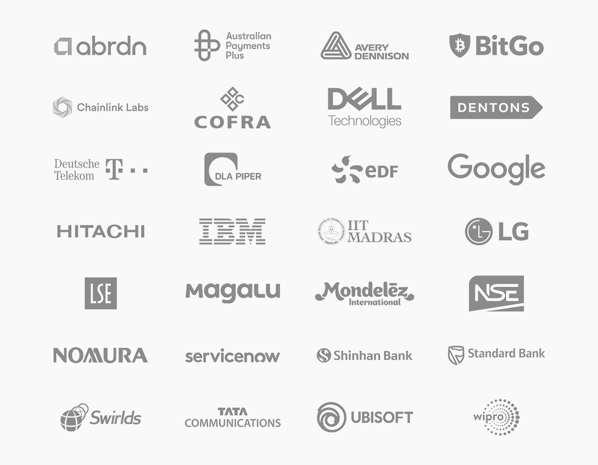
Client logos build trust and boost conversions. – Image Source: Hedera
56
Ensure an SSL Certificate Is Active
If your website doesn’t have an SSL certificate, visitors will see a “Not Secure” warning in their browser. This instantly damages trust and makes users think twice before submitting personal information or making a purchase.
An SSL certificate encrypts data, protecting transactions and sensitive information. It’s also a ranking factor in Google, meaning secure sites perform better in search results. A visible padlock icon in the address bar reassures users that your site is safe, making them more likely to increase conversions.
57
Publish Case Studies
Visitors want proof that your business delivers results. If they can’t see real-world success stories, they may hesitate before committing to your service.
Publishing detailed case studies builds trust by showing how past clients achieved measurable success. According to HubSpot, well-structured case studies can significantly impact credibility, engagement, and conversion rates. Highlighting real challenges, solutions, and results reassures potential customers and encourages them to take action.
58
Add a Visible Contact Page
A business without clear contact details looks suspicious. If visitors struggle to find a way to reach you, they may assume your company isn’t legitimate-or worse, they may go to a competitor with more transparency.
A well-structured contact page should include an email address, phone number, and contact form. Live chat options or direct support links further increase trust. When users feel they can easily reach you, they’re more comfortable making a purchase or submitting their details, leading to higher conversion rates.
59
List Physical Location and Phone Number
Online businesses that don’t display a location or phone number often appear untrustworthy. Visitors may question whether your company is real or if they’ll get support after buying.
Even if you don’t have a physical storefront, listing an office address, service area, or phone number reassures customers that your business is established. Local businesses, in particular, benefit from showing an address, as it helps with local SEO and builds trust with nearby customers. A clear way to contact you makes visitors more confident in taking the next step.
60
Maintain a Blog with Valuable Content
A website with no updates looks abandoned. If visitors see outdated content or no signs of recent activity, they may question whether your business is still active.
Maintaining a regularly updated blog builds credibility and positions you as an authority in your field. Valuable content-like guides, insights, or case studies-keeps visitors engaged and improves search rankings, bringing in more qualified traffic. An active website reassures users that your business is trustworthy, making them more likely to convert.
Content Optimisation
Content is more than just words on a page; it’s what guides your visitors toward taking action. If your content isn’t clear, engaging, or relevant, users won’t stick around. Poorly structured or off-target content frustrates readers and leads to missed opportunities.
Visitors skim, so your content needs to grab attention fast. Use clear headings, bullet points, and short paragraphs to make information easy to digest. The more accessible your content, the more likely users will stay and engage.
Your content should speak to the needs and problems of your audience, with a clear value proposition that makes them want to act. Relevant, well-crafted content helps users understand why they need your product or service and why they should choose you.
Optimising content is a key part of improving your website’s performance. These fixes will ensure your visitors get the right information at the right time, making it easier for them to convert.
61
Use Short, Clear Headlines
Visitors don’t read-they scan. If your headlines are long-winded or unclear, users won’t engage with your content. Confusing headlines lead to confusion, making it harder for visitors to understand your offer and take action.
A strong headline should be clear, direct, and conversion-focused. Instead of “Discover Our Wide Range of Innovative Solutions,” use “Get Faster, More Reliable Hosting Today.” Headlines should immediately tell users what they’ll get, making them more likely to stay on the page and convert.
62
Ensure Every Page Has a Purpose
A website full of unnecessary pages creates clutter and weakens your messaging. If visitors don’t immediately understand why a page exists or how it benefits them, they’re more likely to leave.
Each page should have a clear goal-educating visitors, selling a product, or capturing leads. If a page doesn’t drive conversions or contribute to the user journey, it should be reworked or removed. A focused, streamlined site keeps visitors engaged and moving toward a purchase or inquiry.
63
Keep Paragraphs Short
Large blocks of text overwhelm visitors. If users land on a page and see long, dense paragraphs, they’ll skip over the content-or worse, leave the site entirely.
Breaking content into short, digestible paragraphs makes it easier to scan and absorb information. Each paragraph should focus on a single idea, keeping users engaged and leading them toward a call to action. The easier your content is to read, the more likely visitors are to convert.
64
Use Bullet Points for Easy Reading
Dense paragraphs make it difficult for visitors to quickly find key information. If they have to dig through long blocks of text, they’ll get frustrated and may leave without taking action.
Bullet points highlight important details in a scannable format, keeping users engaged. Instead of writing a paragraph about product features, list them clearly. This structure improves readability, increases retention, and makes it easier for visitors to take the next step.
65
Remove Jargon
Over complicated language makes your content harder to understand. If visitors have to stop and figure out what something means, they’ll lose interest and leave before converting.
For writing clear, user-friendly website content, Nielsen Norman Group explains how concise, scannable text improves readability and keeps visitors engaged.
Your content should be simple, clear, and free from industry jargon. Speak directly to your audience using familiar terms. Instead of “leveraging scalable solutions for business growth,” say “Get a website that grows with your business.” The easier it is for visitors to understand your offer, the more likely they are to convert.
66
Highlight Key Points with Bold Text
Visitors skim rather than read every word. If your key points blend into the rest of the text, they may go unnoticed.
Using bold text to highlight important information makes key messages stand out. Calls to action, product benefits, and pricing details should be immediately visible without requiring users to search for them. When visitors can quickly find what matters, they stay engaged longer and are more likely to convert.
67
Use Engaging Visuals
A website with only text feels dull and overwhelming. Without visuals, visitors may lose interest and leave before taking action.
Adding relevant images, videos, or infographics keeps users engaged and reinforces key messages. Visuals should support conversions-whether it’s product images, explainer videos, or before-and-after comparisons. Well-placed visuals increase engagement and make information easier to digest, leading to higher conversion rates.
68
Ensure Consistency in Tone
Inconsistent messaging creates confusion and weakens trust. If one page sounds formal and technical while another is casual and conversational, visitors may struggle to connect with your brand.
Your website should have a consistent tone that reflects your brand personality and speaks directly to your audience. Whether your brand voice is authoritative, friendly, or professional, it should remain the same across all pages. A clear, familiar voice builds trust and keeps users engaged, making them more likely to convert.
69
Add a Compelling Value Proposition
If visitors don’t understand why your product or service is better than the competition, they won’t convert. A weak or unclear value proposition makes it easy for them to leave without taking action.
Your value proposition should immediately explain the benefits of choosing you. Instead of just listing features, highlight the real value users get-whether it’s saving time, reducing costs, or achieving better results. A strong, well-placed value proposition convinces visitors that they’re in the right place, increasing conversions.
70
Break Up Text with Subheadings
Large blocks of text make pages harder to read. If visitors struggle to scan content, they’ll leave before getting to the important details.
Using descriptive subheadings breaks up long content and makes navigation easier. Each section should clearly indicate what’s coming next, helping users find the information they need quickly. Well-structured content keeps visitors engaged and moving toward conversion points like sign-up forms, checkout pages, or contact sections.
SEO & Traffic Fixes
More traffic doesn’t always mean more conversions. If the right people aren’t finding your site, or if search engines struggle to understand your content, you’re losing potential customers. Investing in SEO services helps attract qualified visitors—people actively searching for what you offer—but that’s only the first step.
SEO isn’t just about driving traffic; it’s about bringing in the right audience and guiding them toward conversion. If your pages aren’t structured properly, users will land on your site and leave before taking action. Poorly optimised pages, confusing navigation, or slow load times can turn away potential leads and sales, no matter how much traffic you generate.
Search engines prioritise websites that provide a fast, seamless user experience. Sites that load quickly, offer clear, valuable content, and are easy to navigate rank higher and retain more visitors. Investing in SEO services in London ensures your site is not only visible in search results but also optimised to keep users engaged and encourage conversions.
These fixes will help improve rankings, increase traffic, and turn more visitors into customers. When SEO and user experience work together, your site becomes a powerful tool for driving business growth.
71
Use Descriptive, Keyword-Rich Titles
Your page title is the first thing users see in search results. If it’s vague or missing important keywords, it won’t attract clicks, and fewer clicks mean fewer conversions.
A strong SEO-friendly title includes relevant keywords while being clear and compelling. Instead of “Our Services”, a better title would be “Expert Web Design & SEO Services for Increased Conversions”. A well-crafted title not only improves search rankings but also encourages users to visit your site, increasing the chances of turning visitors into leads or customers.
72
Optimise Meta Descriptions
A poorly written or missing meta description means lost traffic. If users don’t see a compelling reason to click, they’ll choose a competitor instead.
Your meta description should be clear, engaging, and keyword-rich, summarising the page’s value in 155-160 characters. Instead of a generic description, use one that drives action, like “Boost conversions with fast, high-performing websites. Get bespoke web design tailored for results.” A well-optimised description increases click-through rates (CTR), leading to more traffic and more potential conversions.
73
Use Alt Text for Images
Images improve user experience, but search engines can’t “see” them. If your images lack alt text, they won’t contribute to rankings, and visually impaired users won’t be able to understand their content.
Adding descriptive, keyword-relevant alt text helps search engines index your images properly while improving accessibility. Instead of “image123.jpg,” use “Fast-loading ecommerce website design for better conversions”. Optimised images bring in organic traffic and keep users engaged, increasing the likelihood of increased conversions.
74
Ensure URLs Are Clean and Readable
Long, messy URLs full of numbers and unnecessary characters look unprofessional and hurt SEO. If users don’t trust or understand the link, they may hesitate to click, lowering engagement and conversions.
A clean, keyword-optimised URL (e.g., “yourwebsite.com/living-room-furniture/”) improves both search visibility and user trust. Removing unnecessary words and characters makes URLs easier to read and more likely to attract clicks, which leads to higher traffic and better conversion rates.
75
Optimise for Featured Snippets
Ranking in Google’s Featured Snippets can significantly increase visibility and drive more organic traffic to your site. These snippets appear at the top of search results and provide quick answers, making them a prime opportunity for boosting clicks and conversions. Studies show that users often trust the information displayed in rich snippets, making them more likely to engage with the source website.
To optimise for snippets, structure content using clear headings, bullet points, and concise answers to common queries. Google prioritises well-formatted content that directly answers search intent. Google’s Search Central highlights how properly structured content can improve rankings, enhance credibility, and drive more conversions by positioning your site as a trusted authority.
Image Source: Google
76
Submit a Sitemap to Google
If Google can’t find your pages, they won’t rank, and if they don’t rank, you lose potential traffic and conversions. A sitemap acts as a roadmap for search engines, helping them crawl and index your content efficiently.
Submitting your XML sitemap to Google Search Console ensures that important pages-like service pages, product listings, and landing pages-are discovered and indexed. The faster Google indexes your site, the quicker you’ll attract qualified traffic that’s ready to convert.
77
Improve Internal Linking
A weak internal linking structure makes it harder for users and search engines to navigate your site. If visitors struggle to find relevant content or related products, they’re more likely to leave without converting.
Adding strategic internal links guides users toward conversion-focused pages, like contact forms, pricing pages, or product categories. It also strengthens SEO by distributing page authority. A well-structured linking system keeps users engaged longer and increases the likelihood of turning visitors into customers.
78
Reduce Duplicate Content
Duplicate content confuses search engines, leading to lower rankings. If Google detects multiple versions of the same content, it may not know which one to rank, hurting your visibility and reducing organic traffic.
Use canonical tags to tell search engines which version of a page is the original. Regularly auditing your site with tools like Siteliner or Copyscape helps identify and eliminate duplicate content issues. A clean, well-structured site ranks higher, attracts more visitors, and improves conversion potential.
79
Use Structured Data Markup
Search engines rely on structured data (Schema Markup) to understand and display key information. Without it, your search results may not stand out, leading to lower click-through rates.
Adding structured data for reviews, FAQs, pricing, and product details helps Google display rich snippets-such as star ratings, event details, or recipe instructions. These enhanced search listings attract more clicks, bringing in more potential leads and buyers.
80
Ensure the Site Is Indexed Properly
If Google hasn’t indexed your site, it won’t appear in search results, meaning no organic traffic and no conversions. Even a well-optimised site is useless if search engines can’t find it.
Checking Google Search Console’s Coverage Report ensures your key pages are indexed. Using the site:yourdomain.com search in Google helps verify what’s visible. If critical pages aren’t indexed, fixing the issue ensures your site gets found, bringing in more visitors who are ready to take action.
Checkout & Ecommerce Fixes
A complicated checkout process kills sales. Every extra step, unnecessary form field, or unexpected cost increases cart abandonment. If customers face friction at the final stage, they leave without completing their purchase.
A smooth checkout keeps users focused. It should be fast, clear, and distraction-free. Offering guest checkout, multiple payment options, and transparent pricing helps build confidence. Customers need to feel secure when entering payment details-any hesitation leads to lost revenue.
Speed and trust are everything. Delays, confusing instructions, or security concerns make customers second-guess their decision. Reducing friction at checkout increases conversions without increasing traffic.
These fixes will help you turn more visitors into paying customers.
81
Offer Guest Checkout
Forcing users to create an account before purchasing adds unnecessary friction. If visitors are in a hurry or don’t want to sign up, they may abandon the checkout process entirely.
Enabling guest checkout allows customers to complete their purchase quickly without commitment. Users who have a smooth, hassle-free experience are more likely to return, increasing customer retention and overall conversion rates. You can still offer account creation as an option after the purchase, but it shouldn’t be a requirement.
82
Reduce Checkout Steps
A long, complicated checkout process leads to cart abandonment. Every additional form field, unnecessary page, or redundant question increases the likelihood of users giving up before completing their purchase.
A streamlined checkout with as few steps as possible makes it easier for customers to buy. Consolidating sections like billing and shipping into a single page, auto-filling known details, and allowing one-click payment options improve checkout efficiency and conversion rates.
83
Provide Multiple Payment Options
If a customer reaches checkout but doesn’t see their preferred payment method, they’ll likely leave and shop elsewhere. Limited options create a barrier to purchase, reducing completed transactions.
To optimise ecommerce website designs efficiently, offering a variety of payment methods is essential to capturing more sales. Platforms like WooCommerce make it easy to integrate multiple payment options, including credit/debit cards, PayPal, Apple Pay, Google Pay, Klarna, and Buy Now Pay Later (BNPL) services. The more payment choices you provide, the
84
Use Progress Indicators in Checkout
A checkout process without a clear progress indicator can feel endless, leading users to drop off before completing their purchase. Customers want to know how much more they need to do before finalising their order.
Adding a simple step-by-step progress bar reassures users and keeps them moving through the checkout process. If they see they’re on Step 2 of 3, they’re more likely to finish than if they feel like the process has no end. A clear, guided experience boosts checkout completion rates.
85
Auto-Save Cart Contents
Many users browse and add items to their cart but don’t complete the purchase immediately. If their cart resets when they return, they’ll have to start over, which can lead to frustration and lost sales.
Auto-saving cart contents ensures customers can pick up where they left off. Whether they’re switching devices or coming back later, having their selected items still in the cart reduces friction and increases conversion rates. Email reminders for abandoned carts further encourage users to complete their purchase.
86
Display Shipping Costs Early
Unexpected shipping fees at checkout cause many users to abandon their cart. If customers don’t see shipping costs upfront, they may feel misled and leave before completing their purchase.
Clearly displaying shipping fees on product pages or in the cart summary helps manage expectations. If free shipping isn’t an option, showing an estimated cost early prevents last-minute surprises and keeps conversion rates higher.
87
Offer Free Shipping Where Possible
Shipping costs are one of the biggest barriers to online purchases. Customers are more likely to complete a transaction when they know they won’t have to pay extra for shipping.
If offering free shipping sitewide isn’t feasible, consider setting a minimum order threshold (e.g., “Free shipping on orders over £50”). This not only reduces cart abandonment but can also increase average order value as customers add more items to qualify for free shipping.
88
Use Trust Signals on Checkout Pages
Customers hesitate to enter payment details if they don’t trust your site. A checkout page without visible trust signals can lead to drop-offs, even if users were ready to buy.

Lack of trust is one of the main reasons for cart abandonment. Source: WP Full Pay
Displaying secure payment badges, SSL certificates, and customer reviews near checkout reassures users that their transaction is safe. Mentioning “Secure Checkout – Your Data is Protected” or adding payment provider logos (Visa, Mastercard, PayPal, etc.) builds confidence and encourages users to complete their purchase.
89
Send Abandoned Cart Emails
Many users add products to their cart but leave before checking out. Without a follow-up, those potential sales are lost.
Setting up an automated abandoned cart email sequence reminds users to return and complete their purchase. Emails with a friendly nudge, limited-time discount, or free shipping incentive encourage users to finalise their order. Well-timed reminders recover lost sales and boost conversion rates.
90
Test Different Checkout Layouts
A poorly designed checkout layout leads to confusion and abandoned carts. If forms are hard to read, buttons are too small, or the process feels overwhelming, users will leave before completing their purchase.
A/B testing different checkout designs-such as one-page vs. multi-step checkout, different button placements, and form field arrangements-helps identify what works best. A checkout that feels intuitive and effortless keeps users engaged and increases purchase completion rates.
Analytics & A/B Testing
Guesswork doesn’t grow conversions—data does. Without tracking how users behave on your site, you don’t know what’s working and what’s costing you sales.
Analytics show where visitors drop off, which pages perform best, and how users navigate. A/B testing allows you to compare different versions of a page to see what drives more conversions. Even small changes—like button colours, headlines, or form placements—can make a big impact.
According to Optimizely, businesses that run continuous A/B tests can increase conversion rates by making incremental improvements based on real user data rather than assumptions.
Improving your website isn’t a one-time task. Testing and tracking let you refine every element, ensuring your site constantly evolves to meet user needs.
These fixes will help you make data-driven decisions and maximise results.
91
Set Up Google Analytics
If you’re not tracking visitor behaviour, you have no way of knowing what’s working and what’s costing you conversions. Without data, you’re guessing instead of making informed decisions.
Google Analytics provides insights into traffic sources, user behaviour, and conversion paths, allowing you to see where visitors drop off. Setting up goal tracking for key actions like form submissions, purchases, and sign-ups helps measure success and identify areas for improvement. A data-driven approach ensures higher conversion rates over time.
92
Track Conversion Rates
Traffic alone doesn’t mean success-what matters is how many visitors actually take action. If your conversion rate is low, something is blocking users from completing the journey.
Tracking conversion rates across different pages (landing pages, checkout pages, contact forms) helps pinpoint issues. If one page converts well while another underperforms, you can identify what’s working and apply those insights elsewhere. Optimising conversion rates means making the most of your existing traffic instead of constantly chasing more visitors.
93
Monitor Bounce Rates
A high bounce rate (users leaving after viewing only one page) indicates a problem. If visitors don’t explore further or take action, it means they aren’t finding what they expected or something is driving them away.
Monitoring which pages have the highest bounce rates helps uncover weak spots in user experience. Slow load times, unclear messaging, or weak CTAs can all cause visitors to leave without converting. Reducing friction on these pages keeps users engaged longer and increases the chances of conversions.
94
Analyse Heatmaps to Find Problem Areas
Visitors don’t always behave the way you expect. A page that seems well-designed might have elements users ignore or struggle to interact with.
Heatmaps from tools like Hotjar or Crazy Egg show where users click, scroll, and drop off. If important CTAs go unnoticed, key information is buried, or users abandon forms at specific points, these insights reveal where improvements are needed. Fixing problem areas based on real user behaviour leads to a smoother experience and higher conversions.
95
Use A/B Testing for CTAs
A weak CTA can be the difference between a visitor converting or leaving. If your call-to-action isn’t clear, visible, or compelling, potential customers may hesitate.
A/B testing different button colours, text, placements, and sizes helps determine what gets the most clicks. Small tweaks-like changing “Sign Up” to “Get Your Free Trial”-can have a big impact on conversion rates. Continuous testing and refinement ensure that your CTAs are always optimised for maximum engagement and sales.
96
Test Different Headlines
Your headline is the first thing visitors read. If it doesn’t capture their interest, they’ll leave before engaging with the rest of your content. A weak or unclear headline kills conversions before they even have a chance.
A/B testing different headline variations helps determine which messaging resonates best with your audience. Testing direct vs. benefit-driven headlines, question-based vs. statement-based headlines, and different tones can reveal what keeps users on the page and encourages action. A strong, optimised headline improves engagement, time on page, and overall conversions.
97
Compare Different Page Layouts
A messy or confusing page layout overwhelms visitors and makes it harder for them to find key information. If users struggle to navigate, they’re far less likely to complete a purchase, sign up, or take any action.
Testing different layouts, element positioning, and content structures helps identify what keeps visitors engaged. Some pages convert better with a simplified layout, while others perform better with more detailed information above the fold. Optimising page design ensures that users stay longer, interact more, and convert at a higher rate.
98
Run Speed Tests Regularly
A slow website destroys conversions. Even a one-second delay in page load time can result in a 7% drop in conversions. If you’re not running regular speed tests, you could be losing sales without realising it.
Using tools like Google PageSpeed Insights, GTmetrix, or WebPageTest helps identify slow-loading elements and areas for improvement. Fixing speed issues-like reducing image sizes, enabling caching, and minimising scripts-ensures that users stay engaged and complete their actions instead of leaving out of frustration.
99
Check User Journey Flow
If users don’t move smoothly through your site, they won’t convert. A broken, confusing, or unstructured user journey leads to drop-offs and missed sales.
Tracking how users navigate from landing pages to checkout, form submissions, or other conversion points helps reveal friction areas. If a key page has a high drop-off rate, something is stopping users from completing the journey. Removing unnecessary steps and making navigation more intuitive keeps users moving toward the final action, increasing conversions at every stage.
100
Review Analytics and Adjust Accordingly
Most businesses set up analytics but don’t take action based on the data. Collecting information is useless unless you’re actively using it to improve performance.
Regularly reviewing Google Analytics, heatmaps, A/B test results, and conversion tracking data helps identify what’s working and what needs fixing. If a landing page design isn’t converting, a CTA isn’t being clicked, or a checkout step is causing drop-offs, making small, data-driven adjustments leads to continuous improvement in conversion rates. The best websites aren’t perfect-they’re optimised over time based on real user behaviour.
101
Stop Losing Conversions – Fix or Redesign Your Website
Your website should be a conversion machine. If it’s slow, outdated, or difficult to navigate, it’s driving visitors away and costing you sales. Every second of delay and every frustrating interaction adds friction, making it harder for users to take action.
Some issues can be fixed with targeted improvements-speed optimisation, better navigation, clearer calls-to-action. But if your site is outdated, cluttered, or no longer aligned with your business goals, a website redesign may be the smarter investment. A modern, conversion-focused website ensures your visitors stay engaged, trust your brand, and take action.
If you want to increase conversions on your website, we can help. Whether you need website fixes to improve performance or a complete website redesign, we’ll create a site that works. Faster load times, better usability, and a seamless experience-all designed to turn visitors into customers.
Don’t let an underperforming website limit your business. Get in touch today, and let’s create a high-converting website that turns visitors into customers, increases engagement, improves UX, and drives more sales.